Friday, December 20, 2013


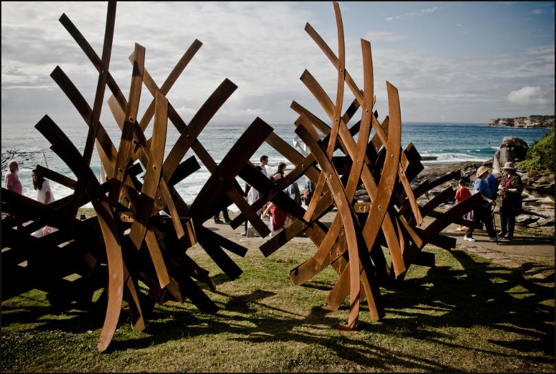
December 21st marks the 1 year anniversary of the death of Rico Eastman. John Patrick “Rico” Eastman was a long time close friend of my dad’s, and a world class metal sculptor. I had the pleasure of knowing him my whole life and especially in the last ten years or so I got to know him more as a friend and mentor. I hope everyone continues to learn from Rico's artistic genius. Here is a link to his website which is still up and maintained by his brother: http://www.ricoeastman.com . Here you will find images of his work, as well as some of his inspirations, documentation from his last show in Sydney, Australia (October 2012) and the piece he assembled and exhibited there “Crosshatch” (above), and Rico’s obituary.


You can also see one of Rico's sculptures, "Bones" (above), out front of Smith & May Inc., Rt. 90, West Rockport, ME.

When my parents were out in Santa Fe for his service they found an interview with Rico, written up in Santa Fe, New Mexico’s monthly arts news publication ‘THE Magazine’, in the April 2005 issue. I found it humorous and inspirational, and I wanted to share it here:

Rico Eastman’s sculpture explores the aesthetics of spatial relationships using a combination of patterned and chaotic elements to metaphorically interpret the way in which new information is integrated into existing systems of thought. His work is exhibited both here and abroad-in Santa Fe he is represented by Riva Yares Gallery. His work can be found in many permanent collections, including, Garret Ltd., Waterford, Ireland; University of Texas, El Paso, Texas; and the Waly Corporation, Hong Kong.

MY SENSE OF ART MAKING
An absolute regard for craft, combined with an appropriate conceptual bias. When my technique or inspiration runs short, as it does from time to time, I listen to Car Talk (National Public Radio). Since I’ve already gotten all their aesthetic issues down, it’s easy to call in and explain a situation, or just eavesdrop on someone else’s problem. Que Bueno. If there’s a busy signal at NPR, I recommend the following books: the Old Testament, the Koran, and the Torah. Read them all at the same time. That should get your knickers in a twist. Then browse The Unknown Craftsman, Art as Experience, The Critical Path, The Essential Rumi, and The Aesthetics of the Japanese Lunchbox. R. Crumb is also a valuable resource. 


CHOICE OF MATERIALS
My early background as a blacksmith has always informed my work, through process, timing, and personality. Steel has been my first choice since then; it is stubborn and enduring, but can be manipulated under the right conditions. Stone and wood are seductive as well. Though it might sound fishy, I am thinking on diving into water. It is the universal solvent, the primary source of health and well-being on our planet. And it can act as a solid, liquid, gas, or plasma. Lots more potential in the long run, and during the last Ice Age, actually allowed hominid migratory patterns to emerge in the Americas through the Bering Sea. Great stuff, and I have a wonderful wellspring to draw from.
 

LIFE AND ART – INSEPERABLE?
If I only had a real life to separate … that would be the true miracle. I wake up at all hours of the night sorting the residue of completed projects, gleaning significance from glitches, and rattling the cage of muses past, present, and future. I was blessed years ago by the spirit of process and invention, but unfortunately never signed a contract with specific hours, perks, or a retirement package.
 

AN ABSENSE OF COMPLEXITY
That’s one of the classic Ono quotes … the question of complexity is enigmatic. There is no art that works outside the hierarchy of culture, personal awareness, and social context. Great visual art really can clarify and distill, since an aesthetic experience is often a pre-verbal, non-linguistic event, and the eyes are a structural extension of the mind/brain system. But who knows what lurks in the shadows of direct perception … so watch out where you shine the flashlight. The two sides of the aesthetic coin are the poetic and the utilitarian. The ongoing question is which side of the bridge do you jump from? But there is another dimension that unifies the apparent distinction. The absence of complexity resides within the tiny Zen ridges on the edge of a dime, connection both sides with the absolute clarity of X-ray vision.
 

BEING UNEASY
Physically, I’ve been on the brink of absolute chaos during the process of installation twice in the past twenty-five years. Once I was fortunate enough to jump from the top of a ladder as a work collapsed mid-way through completion, before the pins were installed and anchored in the pad. The second occasion, I had no choice but to ride it out inside as a developing prototype moved down around me. That’s hard to beat for an adrenaline rush, and terrified would be the real term to describe it. But psychologically, whenever you push into new territory you can risk all your baggage for the sake of finding something fantastically exciting. To drift back into linguistics, what is the definition of “anesthetic”? It is a substance that creates a lack of sensation without the loss of consciousness, right? So by the process of extension, the opposite term, aesthetic, refers to something that shakes you to the core and slaps you silly, wakes you up, frees you from your odd assumptions and ignorance, sending you back out into the world as a true believer. That’s the kind of uneasy I’d be looking for. 


CURRENT WORK/PROJECTS
I’ve got several projects in the works, most using water as a central theme, some of them related to the revolutionary work done at the experimental village of Gaviotas in the llanos of Colombia. The current design focus is the prototype development of low-tech solutions to remedy drought-induced conditions, including a ceramic drip system, an emergent method to reforest inaccessible areas, and a diversion scheme to encourage local grasses to flourish. The most exciting project now is a jazzed-up version of the Archimedes Screw, an age-old device to pump water, re-thought through experiment and observation. I’m simultaneously developing a series of 2-D works using water to distribute oxides in patterned and spontaneous ways. And ongoing is the continued extension of existing bodies of work, which include tensioned steel sculpture and applied design.
TALKING SCULPTURE


I respond to sculpture that acknowledges real-world gravity, but continues to work on you after you’ve walked away from it. Then it becomes a tool for the imagination, similar to how one might react to a great film or performance. That’s where tension, friction, and levity come into play. Conversely, it seems awkward to walk into a place that embraces art that looks like art. That would be the fabled soup described by Nastrudin, devoid of nutrition when you really get down to it, yet still in the same bowl as the real thing might have been. Even salt and pepper won’t help that mess.


Thanks for reading. For more words by Rico, pick up a copy of "Bill Moss - Fabric Artist & Designer", by Marilyn Moss which includes a chapter by Rico in the introduction.

Wednesday, May 22, 2013

Buoys and Light Fixtures


Next on my timeline is Haystack 2012, TA for Sarah Jaeger. I got the scholarship again, for which I am very grateful. Different from the first two times at Haystack, this was a one-week workshop, instead of two. This particular workshop was my second choice when applying. Lesson learned, don’t give them a second choice, and you may be more likely to get your first… That said, I still learned a lot and it was good all-in-all. It was mostly geared towards wheel throwing, which was a good refresher in that, and Sarah is an incredible and highly skilled potter. Her work is finely made and she is a true master, every step of the way. She was great to work with, and I was reminded a lot from her demos about mechanics of throwing and designing specific functions in pots. Her experience making a living as a studio potter for thirty years is truly admirable, and was very valuable for me to hear her talk about. Also, as usual I met lots of great people and the other TAs were great potters who I learned from as well (Nicole Aquillano and Billy Allen). The slide lectures from all the instructors, and sometimes Haystack staff, were indeed impressive as usual. Hoss Haley, Stefanie Rocknak, Joyce Scott, and Collette Fu, Kiristina Logan, and Monica Wood, are all amazing artists. 


"Buoy Bowl" Porcelain, H. 3.5", Shoham Arad, 2013. 


Two other projects I would like to mention as part of my ceramics journey are the Buoy Bowls and the infamous ‘chandelier.’ The Buoy Bowl is a design idea created by a NYC based designer named Shoham Arad. She approached me a couple years ago with the deflated, rubber nautical buoy and asked if I could make it in porcelain… Eventually this happened, and now there are some at Steven Allen in New York and on the web. Interesting experience here - certainly worth my while if looked at as a learning experience, however not as a way to get rich, so far anyways. The form is hollow cast in porcelain and fired to cone 10. 


“Untitled Chandelier”, Copper, porcelain, brass, LEDs, sockets, electrical wire, H. 78’’, W. Josiah Glover &
Austin P. Smith, 2013.


This gives you an idea of what time of year we are in here.

And what kind of an electrical situation we were faced with.

The chandelier is a collaboration/custom/commission/learning experience with J Glover Designs, which was finally completed this past winter. Long story short, it is currently for sale, so please contact me or Josiah if you or someone you know is interested in showing or purchasing it! A beautiful piece - industrial yet abstract, refined, and highly functional. The design and skilled craftsmanship of Josiah Glover is something to be noted for sure. Copper tubing bent to perfection, hand spun copper caps for the porcelain fixtures, and an ingenious mechanism for securing the fixtures and wiring the bulbs (dim-able LEDs) to the apparatus. The egg shaped porcelain globes stem from design ideas and preferences of the former client, as well as numerous brainstorms between Josiah and me. We settled on a simple, non-pointed form, including structural compound curves for maximum strength, ideal for high-firing such thin, porcelain castings. We incorporated mold parting-lines into the design, to be revealed only when the lights are on. It is only when the lights come on that each globe exposes its uniqueness. The flawless, smooth, celadon glaze compliments the copper very nicely during the daytime hours.

Monday, May 20, 2013

Cups w/ Chart Decals

 Cup, porcelain with "in-glaze" decal, H. 4.5'', 2011.

I have been using decals in some of my work ever since the Haystack class with Andy Brayman, in which I learned how to screen-print decals using ceramic ink. The decal used on the above cup is an "in glaze" decal, where, after the decal is applied, the cup is fired to cone 2 and the ink actually melts into the glaze, as opposed to over glaze or "on glaze" decal which is fired to cone 017 and sits on top of the glaze (permanently fused).

In thinking about what subject matter I might like to incorporate, I settled on a section of navigational charts from Penobscot Bay. These particular charts are straight from familiar parts of the bay which I have had the privilege of boating in since childhood. The imagery is nostalgic for me, and reminds me of how awesome the summer time in Maine is, learning how to read charts with my dad, and driving the launch at Wayfarer Marine as a summer job.


 4oz. Cups, porcelain and decals, H. 3.5'', 2012.

10 oz cups, porcelain and decals, H. 4.5'', 2012.

 4oz. Cups, porcelain and decals, H. 3.5'', 2012.

I love how when printed in one contrasting tone, the lines and text stand out visually against the rich glaze. The idea for a decaled bottom surface comes from wanting to integrate the bottom somehow into the user’s experience, and so it’s not just plain raw porcelain. When you are sitting across from someone, you catch a glimpse of the chart as they take a drink, and go from there. Out on your yacht, before you pour your drink, or maybe after you’ve had one, you turn the cup over and ponder which cove you might visit tomorrow morning, or memorize where the rocks are around your favorite anchorage... Okay, that might be a stretch for some, but it seems that people (locals and vacationers alike) recognize that the decals are there as more than just an interesting decoration - the charts become a connection between person, place, and piece.

Below is my current work that includes chart decals. These are decals that I ordered from a company that screen prints lead-free, monotone decals. They also digitally print full color decals, however most contain trace amounts of lead. I plan to someday set up my own printing area, as it is always better when you can make it yourself! One of the drawbacks to ordering from a company is that their standards of quality might not be as high as yours, and they probably use commercially available inks - which have generally been sitting on a shelf for years and years, and can tend to not print very well.


 4oz. Cups, porcelain and decals, H. 4.5'', 2013.

 5oz. Cups, porcelain and decals, H. 2.25'', 2013.

10oz. Cups, porcelain and decals, H. 4.5'', 2013.

Whiskey Cups, porcelain and decals, H. 2.5'', 2013.

Pint Cups, porcelain and decals, H. 6.5'', 2013.

Salt Cellars with chart wrapped bottom, porcelain and decals, H. 1.5'', 2013.

Saturday, May 11, 2013

New Studio!

Since Haystack 2010, a lot has happened; in my life and in the studio. I was still living in Rockland then, and remained there until July 2012, when my then fiancé, Jess, and I moved our studios and home to Camden. I was lucky enough to have a space available to move my studio to, and coincidentally the closing of the Lincoln Street Center was at the same time that a family owned apartment opened up at my grandmother’s residence - what us Smiths refer to as Melvin Heights. Conveniently the studio is right next to the apartment, and thanks hugely to my dad (Sam) and also to my uncle (Ben), I was able to get the space move-in-ready, just in time. 


My dad’s old shop - now my studio. After completing trade school in the early 70s he built this shop for a place to work on Volkswagens and other vehicles that may have needed repair or engine replacement. It has also served as boat builder’s and carpenter’s workshops over the years. Still has the tiny door within the barn door for a mast to poke out through.


If we rewind back to 2010, I believe the next exciting thing to happen in my studio is again a Haystack experience. This time I did not apply for the scholarship, but went as a student. When I heard Andy Brayman would be teaching a ceramic printing class there I knew I had to take it.

In the Spring of 2005, as a second year student at Bennington, I had the pleasure of taking a class with Andy while he was teaching his last semester there, before moving to Kansas City to start his two businesses, Easy Ceramic Decals, and The Matter Factory. As a young ceramics student at Bennington College my eyes were already wide open and I wanted to try as many different processes as possible and this semester in particular was quite memorable. It was geared towards wheel thrown pottery, and I had just spent Field Work Term practicing centering and beginning to throw at Camden Hills Regional High School as a studio/teaching assistant for Simon van der Ven (my high school clay teacher, and friend and mentor ever since). So this was good timing to take a throwing class, and Andy was a great all around teacher. We were focused on making contemporary pottery, so we were glazing and we completed high temperature firings in gas reduction kilns, soda firings, fired Raku, and as a department fired the wood kiln too! A great range of forms and surfaces were achieved and a huge amount learned. 


For the next FWT, I was fortunate enough to go out to Kansas City with Alex Curtis and Nate Philbrick, two good buddies and fellow students of Andy, and intern at the Matter Factory while living in Andy’s apartment with his two cats, Rodney and Thomas. This was an awesome experience and a seriously important part of my education. Here we learned in depth about mold making and slip casting, ram-pressing, ceramic decals, and glaze testing, as well as field tripping around to as many artists’ studios and college clay department tours as there was time for. Also, for a couple days we assisted in the construction of Marshall Maude’s anagama in rural Kansas somewhere, where the beer was 3% and the land was flat.

So, even having already studied with and interned for Andy, I knew this was going to be an important class to take at Haystack, full of nearly all new information. My ceramic printing experience thus far was limited to digitally printed decal application on my pots and doing one decal firing. In Printing for Ceramics 2011 at Haystack, we learned how to screen print ceramic decals from scratch, by hand, in multiple ways, in order to achieve multiple results.  While we made ceramic objects, we also gathered or created imagery to develop into screens, to print with the ceramic ink we made, on the home-made vacuum table/screen printing press. In two weeks we had finished glazed objects with fired on decals, and stacks of freshly printed decals for future use, plus a mind bursting with new information and inspiration. This made me fall in love with Haystack all over again and this time was as rewarding and fulfilling as the last. Andy  continues to inspire and is a true wealth of knowledge. At the bottom of this post is a video of Andy printing cover coat on our decals with the assistance of TA Mitch Shiles. 


Here's a cup I made during the class. Wheel thrown porcelain. The decal is from a digital image I took of a tree on campus. In my next post (SOON) I will show more work I made using decals I made, as well as some more current work with other decals I ordered from a screen-printed decal company